Thursday, January 12, 2012

“Clouds may come, but clouds must go, and they all have a silver lining. For behind each cloud you know, the sun, or moon, is shining.”

~Unknown
The overall arching theme of my third semester of Sculpture was Hope--being able to see the miraculous in the mundane. For my final project, I wanted to do something completely different than what I had previously done. I'm not really certain how I came up with the idea. Looking back, I think this might have been my motivation:

As a kid, I loved Lite-Brites. I have very fond memories of fighting Sarah over who got to play with it, relished every single time I pressed the pointy-end of the pin through the black construction paper and was mesmerized by the resulting beam of light (I guess it's the simple things, right?). While surfing online, I found this awesome "Push and Store Cabinet" designed by Chung-Tang Ho. It reminded me of those awesome Pin Art executive desk toys. I thought that perhaps I could combine my love of Lite-Brites with Pin Art and some how meld it into a HOPE-themed project. Whew.

I decided I would make a light box and use extruded acrylic rod to act as the pins for the project. I wanted to round one end of the "pin" and keep the other end flat. My hope was that this would turn the "pins" into small lenses. I bought 6-ft lengths in 5/8", 1/4", 1/2" and 3/4" diameters. I cut those rods down to ~3" segments, and wrapped painter's tape around one end.
To keep the rounded ends as symmetrical as possible, I loaded the rods into the chuck of my drill press. Since I don't have a lathe, this was the best solution. The only problem was that my chuck was 3/8" so I couldn't use this method to rounds out the larger stock. The taped end went into the chuck (the tape protected the end from being marred by the chuck).
Then I used some metal files to initially round the end. I started out with a file that was almost like a rasp, and move to finer files as I got the basic shape down.

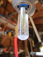
This is what it looked like after filing was complete.
After filing was done, I moved onto sandpaper. I started regular old coarse sandpaper in 80, 100, and 120 grits.
Then I moved onto wet/dry sandpaper in 220, 320, 400, 600, 800, 1000, and 1500 grits.
This is what the rounded end looked like after I was done sanding it with the 1500 grit paper. After I had rounded the ends of all the cut rods, I used a sanding block to sand the flat ends smooth. I skipped the files and moved straight on to the paper, starting at 80 grit and ending with 1500 grit. I hand rounded and sanded the acrylic rods that were too large to fit into the 3/8" chuck of the drill press, using the same procedure as sanding the flat ends. After all of the rods were rounded and sanded flat, I slathered on metal polish, and then used my fabric polishing attachment to my Dremmel and polished the heck out of each rod. Collectively, I'd say it took about 45 hours to do this (I'm not kidding!) process. It was a PAIN and took forever and ever.
Next I went about constructing my light box. I originally intended on using some really old walnut that I had lying around, but I nixed that when I realized I wanted to make the box several inches tall and my walnut was only 4 inches wide. I settled on some hard maple instead. First I cut the box sides to make a 6" x 9" x 6" rectangle. For my design, I wanted to have a sheet of acrylic glass suspended over the lights where I could attach an image. The I needed another sheet of acrylic suspended some distance from there where the rods would rest. Somehow I jammed up my palm router, so that was out of commission, so I had to use the table saw to cut the grooves for the box. It was slow work using the table saw, but it turned out well. Before I put the sides together, I sanded the insides. I fitted the box together using wood glue and nails, making sure to insert the first sheet of acrylic before putting on the final side. To elevate the box a bit from the surface below, I hammered in some decorative thumb tacks. This is the view of the bottom of the piece:
This is another view of the bottom, where you can see image that was inserted above the suspended acrylic sheet. You can also see the LED tap-light I used for illumination.
This is the top view of the image (a cloud with the sun peaking out behind it). This was set on top of the suspended acrylic sheet.
Here's the view with the lights on. I need to go back and sand the acrylic sheet to diffuse the light a bit.
And this is the view from the top with the second acrylic piece suspended.
I constructed a four-sided box (no top and no bottom) out of acrylic sheeting to contain the acrylic rods, and then assembled the rods on top of the acrylic sheet. I put the rounded end of the rods pointed towards the image, so the flat ends were at the top.
Here you can see what the individual rods looked like after they were sanded and polished.
And this is the view from the top of the piece.
You can look through individual rod lenses to see the image behind them.
See it? It's a cloud with a silver lining!
This is how I wanted the piece interpreted: when we focus on the things immediately in front of us, they blur our vision to seeing the larger picture. The individual rods are like raindrops on a window--dreary and blurry. But they illuminate and magnify what's beyond them when you look closely at/through them.

It doesn't photograph well, but it turned out exactly as I had imagine it :o) I think it has great potential for being a series of pieces. If only it didn't take so damned long to make! Click here to see more pictures of it.

"What the caterpillar calls the end of the world, the master calls a butterfly."

~Richard Bach
For the third semester of the Sculpture class I'm taking at the local community college, the instructor gave me free reign to do whatever I wanted, so long as I set my own schedule and met my goals. The kicker is that the projects had to revolve around a centralized theme. I struggle with themes. Mostly, I just make whatever I think is pretty, and don't really care too much whether some other person would classify it as ART. So rather than worry about it too much, I just decided one four projects that I wanted to do and used the shoe horn to smash my evil step sister foot into the glass slipper.

I decided my theme would be hope. Being able to see the miracle in the mundane--separate the wheat from the chaff, that sort of thing. While I was content with how my butterfly sculpture from the Spring semester turned out, I wanted to readdress it and make it larger. And more colourful. And somehow cram it into having a HOPEful message. So I made more paper butterflies, using the same techniques as I did in the Spring, but not limiting my colour palette to blues. I reused the blue butterflies from the old sculpture, and added about 25 more. Again, I used high def colour photos of real butterflies and moth as my reference material.

I used a much larger sheet of galvanized steel and beat it with a hammer against the concrete of my driveway--I'm sure the neighbour's LOVED that. I wanted the piece to be a wall hanging, so I drilled two holes in the backside and strung wire through it. Then I glued the butterflies on as randomly as I could.

This is the finished product.
And a close up of one of the moths.
I know I need to go back and add more/better photos. So check this flickr set later for better pics.

Now that I've done the butterfly thing twice, I know why I haven't really been enthusiastically happy with it. When I have the time, I'm going to do a third run at it. This time, I'm going to make the butterflies substantially smaller--like total circumference being around 1.5-2" and all with the same wing pattern and I'm going to make a BUNCH of them, all in rainbow colours. Like (10) per ROYGBIV. And I'm going to arrange them in a swirling pattern up a more cone-shaped piece of galvanized steel.

I think it would be a nice companion piece to this one. One being order and the other being chaos.

But sheesh, making the butterflies took a long time, so I'll tackle the companion piece later. I'll add it to my list.

"The butterfly counts not months but moments, and has time enough."

~Rabindranath Tagore
Spring 2011, I took the second semester of Sculpture class at my local community college. I had the same instructor as the first semester, and two classmates from that class joined me. The instructor didn't want to hamper our creativity and decided that we could collectively decide what we wanted to do. The three of us came up with six projects/subjects to tackle during the semester, and timed things so we would present our works on the same days as the Sculpture 1 students were.

We decided on the following projects:
  1. Use colour to convey an emotion
  2. Use texture to convey a touch-sensation
  3. Use of light/shadow on the human body
  4. Convey the passage of time
  5. Use three or more malleable materials together to create something new
  6. Found object: manipulation or assemblage
For my first project, I couldn't decide what to do. I tend to prefer monochromatic works, even better if it's black/white/shades of gray. I have a hard time committing to colour, especially in art.

Several years ago, I was at the San Diego Zoo in the gift shop, and I saw some beautiful butterfly specimen shadow boxes. I loved them, and wanted them, but had a hard time justifying both the expense and the thought of displaying something dead in my home (houseplants being the exception). So I decided to make my own butterfly specimens using paper and Prismacolours. I made my mom a Blue Morpho and my sister a Monarch. And they were, if I say so myself, spectacular. I had meant to make some for myself, but the project was perpetually waylaid for other shiny things that caught my attention. But this sculpture project gave me the perfect excuse to make some butterflies again!

First I collected as many high quality photographs of butterflies as I could. I decided to limit my palette to blue butterflies. I made wing templates for each butterfly so I could ensure both sides were as symmetrical as possible. I then traced a set of wings on I used plain white card stock paper and coloured the wings in using Prismacolours. I tried to make them as realistic I could. In all, I had completed 5 different types of butterflies. I made the decision to only colour the top-side of the wings, and painted the backsides using flat white acrylic paint. After I cut the wings out (leaving a little extra "tabs" on the inside of the wings so I could insert them into the bodies), I ran the edges along the tip of a chartreuse Prismacolour to call attention to the edge.

I made their little bodies out of Sculpey III polymer clay, and inserted 28 gauge steel wire for legs and antennae. Before I baked them, I made slits along the thorax so I could insert the wings later. There was a slight baking mishap (darn Josh!) and evidently polymer clay EXPANDS greatly when fired at 500 degrees. Who knew? But I rolled with the punches (and cursed Josh under my breath), and used the bodies anyway.

I typically struggle with coming up with bases for my sculpture pieces. A bad base can ruin a piece pretty easily. I got it into my head that a crumpled piece of galvanized steel would be cool, so I grabbed some roof flashing from Lowes and beat the crap out of it on concrete using a hammer. I then made a square base by stacking/laminating together several sheets of MDF and then spray painted it gloss black. I drilled two holes in the top and inserted short lengths of dowel that had also been painted black. Then I hot-glued the crumpled flashing to the dowels, and then glued the butterfly legs to the flashing.

This is the finished product:
View from above, complete with Albert's socked kitty-feeties. Note that the red on the sheeting is the reflection of my red wool coat on the coat rack.

View from the side.

I was pleased with how the piece turned out, but didn't have a whole lot to say about it. So I polled friends. Here's what I/we came up with:
  • Butterflies are the second life-phase of a creature.
  • The butterflies are vain, and they're trying to look at themselves in the shiny reflective surface of the metal. (which makes my decision to keep the underside of the wings matte white interesting, since the reflection of an individual butterfly's wings is plain white)
  • The crumpled, shiny metal energizes the space between the sculpture and the viewer, compelling the viewer to look more closely.
  • I've always been fascinated with how quickly nature can take over after man relinquishes control of something. This piece kind of shows that. This idea could have been amped up by using rusted metal.
  • My sculpture instructor, a painter by trade/obsession, said he was YEARNING for some orange in the piece.
So there you have it. Click here to see more pictures of the piece.

Thursday, May 19, 2011

Thar Be Treasures! Part Deux

Waaaay back in the day, just after we bought the house, John was cabling the upstairs for tv and internet, and came across a lamp base behind the knee wall that surrounds the perimeter of the entire upper level. I had the grandiose idea that I would paint the base and attach some sort of awesome lamp shade and it would be an awesome homage to the origins of the house.
I started out by wielding a can of RustOleum Universal Hammered Spray Paint in Silver. It looked alright, though I wasn't omfg in love with it. So I stripped it with paint thinner (and killed off more than a few brain cells in the process. There goes algebra!) (Hah! as if I knew algebra in the first place!) and applied a new coat of Heirloom white. It looked pretty schnazzy, and I was happy with it.
Oh! I forgot to mention that the cord on the base was insanely old and one of the connectors was haphazardly attached, so I decided to rewire it. Simple task, to be sure. Except I kept blowing the breaker. Boo.
Next, I tackled the shade. I wanted something pretty and graphic, but didn't like the options I found online or in stores. I liked this one a lot, but I have a hard time spending $ on something I think I can do myself. So I went out to JC Penny and scored a big old drum shade at 40% off, and then went to Jo-Ann's to pick up some Jacquard Neopaque fabric paint in white, black, and deep red.
For the next forty hours or so (I *so* wish I was exaggerating), I hand painted the red blossom/black branch/white accent pattern on the shade. The paint was quite easy to work with, but I completely underestimated the total area of the shade that would need to be painted. So while the small/intricate pattern seemed easy peasy when I started, by the end it felt boring and tedious.
After the shade was finally finished, I attached it to base, and was pleased enough. I set it on the Frankenstein Table and moved onto the next project. A few weeks later, something fell behind Frankenstein, and rather than pull the ottomans out from underneath it to retrieve the item, I decided to pull the table over. As Frankenstein's are want to do, he lumbered forward and CRASH BAM BOOM, the legs collapsed and everything on top of it toppled off onto the floor. Pirate Lamp died, as did several small marble vases my mom had found for me. DAMN IT. AND I didn't even get a picture of the damned thing before it shattered.
So I spent several months trying to find a suitable replacement base for my magnificent lamp shade. I was determined the thrift it, because my mom and sister are such talented thrifters and certainly *I* would be able to do it! HAH.
As any sad and pathetic person might do, I was at Ikea on my birthday. I snagged a Jonsbo Barby lamp base in a pale pale pink. The only problem is that the base is designed for a Spider/Harp shade, and my shade is a Slip Uno Fitter. A tube of JB weld and wire cutters fixed the problem. And BAM, I had a gorgeous lamp with a magnificent shade.

Click here for more pictures of the new lamp with its beautiful shade :o)

Wednesday, May 11, 2011

Carving my way Through Hell Part Deux

Dante's Third Circle is reserved for Gluttons, and while I still firmly hold that carvers inhabit his Seventh Circle, I decided to punish/challenge myself and take another stab at carving. The parameters of this project were simple: create a sculpture of the human form and focus on the play of light/darkness.
Realizing how freaking hard it is to carve, I decided to create a mold that would better lend itself to what I envisioned the final product to be. I used an old realtor sign that I bought with the house; it was made of corrugated plastic. I wanted the final sculpture to be able to stand upright, and have smooth top, bottom, and sides, so the corrugated plastic was perfect. I also wanted the bottom of the piece to be thicker than the top of the piece, I built an angle into the bottom of the mold. This is what the mold looks like.
For the sculpture itself, one of my favourite sketches I did when I took figure drawing back in college was of a knee. It's a bit strange, I agree, but I really liked the sketch. And I've always loved that the human form, when truncated and broken up into segments (NOT like the Ice Truck Killer!!!) becomes abstract and almost like a landscape. I did a water colour painting in for my Senior Art Show that demonstrated that (sadly, the painting was destroyed when I "accidentally" left it outside in the elements for a few months. However, before I painted it, I did a colour pastel drawing of it. Here:
Now imagine it's monochromatic black and white watercolour, and you can imagine how it might be mistaken as a landscape).
So I decided to base my sculpture on that figure drawing sketch from so many years ago.
The problem with the sketch was that it wasn't the exact angle I wanted to use. So I needed more reference material. Unfortunately, Googling "kneeling woman profile" made me feel very very pervy. A classmate, who is a Physical Therapist, took pity on me and gave me some nice colour copies of the knee from several of her anatomy/physiology texts, and those helped a lot.
Carving is something that's really difficult to me, because my brain doesn't "see" what needs to be removed in order to get the shape out of the piece. I'm too paranoid that I'll take off more than I mean to, and because plaster is a once-it's-gone-there's-nothing-you-can-do-to-get-it-back medium, I was very very scared of taking too much off. I spent around 15-20 hours working on this piece, and I was quite pleased with the result.
Since I'm not a camera whiz, I had a hard time capturing shadow.
Unfortunately, most people outside of my class thought it was either a tongue or a butt crack (could be a reflection of the type of people I was asking and not necessarily the piece itself), but everyone in the class knew what it was (though I couldn't really tell if they were sincere or if they were humouring me).
When I showed it in class, I brought my own spotlight, and hard them turn off the overhead, so I think the subject matter might've been clearer.
Anyway, I was happy with the piece, and would--if I'm bored/insane enough--like to create several companion pieces. Like of a neck, of a shoulder, of a collar bone.
More can be viewed here.

Tuesday, May 10, 2011

Charity Begins at Home

I can clearly remember than in Mrs. Burns' Fourth Grade Class, one of the art projects we undertook was making masks related to Idaho History. The FUN activity involved dragging out mothers in on a weekday, Vaseline, and hanging out in the teacher's lounge (SO COOL!!!!!!!!). Our loving months applied plastered gauze strips to our greased up faces and we tried desperately not to hyperventilate as we breathed through straws stuck up our noses. My face mask was AWESOME, and I applied braided gauze strips to it later. A quick paint job, and I had a slamming Sacagawea mask. I'm pretty sure I work that thing around the house far more than was a good idea, and I was REALLY sad when I had to glue it to a project board with a description of Sacagawea's significance in Idaho History.
A few years later, as a Girl Scouts project, I got to make another life-cast mask, and painted this one as Spider-Man. I proudly brought it with me to college, and have it safely packed away in a box of memorabilia (hmmm...wonder if it still fits???).
So, when my sculpture instructor said that one of the final projects in the Beginning class would be to use plastered gauze strips on a piece, I was ecstatic. Really. We had to create three figures, at least six feet tall, interacting with each other and attached to the same base. The kicker was that one of the figures needed wings. Now, my first thought for the piece was horribly inappropriate and dealt with an in flagrante delicto Peeping Tom angel figure and a Beast with Two Backs. There were several religious people in the class, and I thought fo'sho they'd be insulted. And while I thought it would be an amusing piece, it wouldn't be anything I'd want to keep in my house, and could really see doing anything at all with it after the in-class critique.
So instead, I decided to do something with a baby, a beggar, an angel, and a woman--something safe. The challenge of the assignment was to create figures that utilized the concepts of the Golden Ratio. With the four figures, I was able to utilize as many standard options with the Golden Ratio as possible (male, female, child). So the figures were created using tie wire as the frame, and aluminum foil and hot glue to provide bulk. I gave the woman boobs and wider hips, and made the angel figure taller/broader than the other figures. After the figures were foiled, I applied the moistened gauze. I didn't go crazy with clothing, but I gave the woman a dress and the man a shirt. The only special treatment to the handle was the wings.
I think the most fun I had with the project was creating the prim and the park bench. The prim is made in the same manner as the figures (wire frame, foil girth, and plaster covering), and I added flattened out beer caps to made wheels. The bench is made out of FREE paint stirring sticks that I sliced into smaller strips and sanded to remove the HOME DEPOT logo. The slats are attached to a tie wire frame that I wrapped with 28-gauge steel wire; this kept the strips of tie wire together and made the frame look more like wrought iron.
Since the project required a base, I made one out of maple and plywood. I covered it with moss and sand to emulate a park scene. When I designed the figures, I left wire poking out from below their feet so I could drill a hole into the base and insert the wire; it worked out really well, as the figured were pretty darned stationary once they were attached to the base. This is how it turned out:
When I presented the project to the class, I had several talking points. The first was the importance of using a pram instead of an American stroller. I've always wondered if children who rode around in a stroller have a more outwardly world view than children who rode around in a pram (since the stroller babies are pointed out towards the world, and pram babies are pointed towards the mother/care taker).
The idea here was the importance of observing charity in action. Since the baby is in the pram looking at the mother, it sees the mother handing the money to the beggar, and plants the seed for charity in the child. (It's a stretch).
I struggled as to where to place the angel figure because its placement has implications on Good Works versus Virtuous Acts (see, mom! I *did* learn something in Confirmation!). If the angel were behind the woman, one could argue that she was doing Good Work, as if compelled by the angel. With the angel behind the beggar, the act becomes a Virtuous Act.
In the end, I found the piece more meaningful if the angel were behind the beggar. Additionally, it's as if the beggar were being looked after by the angel.
Overall, I'm kind of "meh" about the piece. I think it's rather boring, and I have no idea what I'll do with it. Right now it's sitting in a milk crate in the dining room, collecting dust. I spent around 15 hours working on it, and I think the figures are pretty neat, so I don't have the heart to chuck it. Perhaps I'll post it on Etsy and see if there's anyone out there who wants it. Click here for more (bad) photos.

Monday, May 9, 2011

Carving my way Through Hell

Perhaps the most difficult project I tackled during the Beginning Sculpture class last fall was carving. As I like to tell anyone who will listen (and even those who don't), I am a CREATOR and not a DESTROYER. That is to say, carving is an activity commonly enjoyed by those individuals who occupy the outer ring of the Seventh Circle of Hell.
The assignment sounded simple: carve something out of a solid something else. The instructor provided plaster, and since I had paid a $15 materials fee and plaster was only one of two materials to be provided all semester, I wanted to get my damned money's worth and use some plaster! Plaster, for you lucky uninitiated, starts out as a white powder and hardens once mixed with water. It will take on whatever shape it's poured into (a process called "molding"). I had very little experience with carving, and decided I would create something that was non-representational so it wouldn't have to be recognizable as something else. Using a rectangular box as a mold, I was going to carve out three long, curving tendrils (think, aloe vera leaves) that point up, attached to a square base. After 2.5 weeks of class time (~6 hours a week, so a total of nearly 15 hours), I was no where near done, and the project was due during the next class. So I made three new molds of three different sized plastic food storage bins, and frantically tried to figure out something to carve.
I settled on three stylized birds of different sizes. The littlest is my favourite. Click here for more equally crappy photos of them.
The problem was that when I mixed the plaster and water, I used WAY too much water, and even after it was set, the plaster was too wet to really work with. So I baked the three molds at 250 degrees for something like 5 hours. That dried them out VERY nicely. So nicely, in fact, that the slightest brushing a finger would mar the surface. Which make carving even more difficult, and made preserving them nearly impossible. I tried using a water-soluble varnish on them, and besides turning them yellow, it's flaking off like crazy. I think when the weathers a bit more predictable (and I'm motivated to do so), I'll use a white spray paint on them and hope I can get it thick enough that it'll stick.

Friday, January 28, 2011

Squeezing the Life Out of Weeds Plants

My mom insisted that my two brothers, sister and I took specific projects in 4-H when we were kids. Our first year, we had to take Helping Mom & Dad (a ploy to get us to pitch in more) and Idaho Wildlife (in hopes of fostering naturalist feelings towards our native fauna). The second year, we could take one project of our choosing, and we also had to take a project on native weeds plants. Now, for me, that was torture. By that time, I had spent a summer out in the bean fields, grudgingly weeding (or, as I like to say, Hoe-ing. Yeah, so I can tell people that I was a professional Ho-er by the time I was 11. I get some craaaazy looks, and it amuses me so). I hated weeds and had no appreciation for their non-weedy kin. But I really wanted to take the other project (cooking, I believe), so I took up the flora cause and spent the summer collecting, pressing and preserving the various native and non-native weeds plants of Idaho's Snake River Plain. Yee-haw. (I guess there's some lesson in knowing one's enemy)
Why am I mentioning it? Because one of things we had to do as part of the project was create a weed plant press. And my mom's design was, quite honestly, ingenious, and I don't think I've seen it replicated. And lately, I've had this URGE to squeeze the life-blood out of the weeds plants that litter my landscape. So I decided to recreate my mom's ingenious weed plant press, and take some piccies of the finished product. Because, you know, *someone* might be planning on forcing their kidlets into taking a Flora Preservation/Appreciation project in 4-H or they're trying to foster some young naturalist tendencies in their precocious offspring.
Supplies:
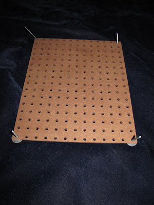
  • Pre-finished Pegboard (~2' x 4' is sufficient) Mine has an enameled finishon one side, bare on the other
  • Long machine screws with round ends. Mine are 3" and 1.5"
  • Matching washers
  • Matching wing nuts
  • Jig or table saw
  • Newspaper or Corrugated cardboard
I didn't bother to take pictures of the process, as I was lazy and didn't think they'd add much (and I made enough mistakes that I would have felt embarrassed to have documented them).
First, I cut the pegboard into two 17" segments (leaving me a good amount left over), giving me two 17" x 24" boards. I cut ~10 off the length of these, making them ~17" x 14". Next, I put wrong-sides together (be sure to do this!!), and lined up the holes. I then used the table saw to cut off the excess. I did the same thing with the two 10" x 17" remnants, and then cut them in half length-wise, so I had two more small presses (I'll give one to my friend who loves wildflowers).
That's all it takes (plus the screws, washers, and wing nuts)--the press is now ready to use. All you have to do is take the screws and one washer per screw, and thread them through the four corners of one of pieces of pegboard. Layer newspaper (or corrugated cardboard; whatever floats your boat), a single layer of weeds plants, then more newspaper, then more weeds plants, etc etc. After a reasonable number of layers, add the matching piece of pegboard and slide it over the screws. Add the second washer and screw it down using the wing nuts. Et voilĂ ! An easy to use, easy to assemble weed plant press. For the larger press, I added a second set of screws/washers/wing nuts to the center of the lengthwise edge on each side, just to give it a bit more pressing power. The holes of the pegboard allow enough air to penetrate through the newspaper to adequately dry the weeds plants. It might not be as fancy-schmancy as some retail plant presses, but it works well for me!
I bought the 2' x 4' sheet of pegboard from Home Depot for $6.15. The screws, washers, and wing nuts cost $6.66 (freaked out the cashier!). So for around $14, I have three rather nice, quite kick-assery weed plant presses. Awesome.
Click for more pictures, although they're just different shots of the same thing :o)
And, for good measure, a picture of Albert.

Tuesday, October 12, 2010

Birds of a Feather

The second medium that we worked with in my sculpture class was wire. The assignment sounded easy: using wire, create one sculpture that appears heavy, and one sculpture that appears light. We were to consider our materials, the colour, and the visual weight of our method when creating our sculptures (thin wire appears lighter than thick wire, silver wire appears lighter than black wire, simple lines appear lighter than tightly wound lines).

The first night of class at the beginning of the semester, when the instructor briefly talked about the materials we would be using, I had an instant idea of what I wanted to make out of wire. I was so excited about it that I couldn't get my mind to stop thinking about it when I went to bed, so I finally got up and grabbed my sketchbook and made a lovely scribble of the idea. Then I could sleep. I really wanted to make a bird.

My grandma was a great collector of bird sculptures. By then end of her life, she had (literally) hundreds of bird sculptures and trinkets. The curio cabinet she had commissioned was CRAMMED full of them. They perched on window sills and graced tabletops. They peaked out from behind books, and were gracefully poised on the floor. Now, 5 years after her death, I still have the fleeting "Grandma would like this" thought every time I pass a bird on a shelf. While my grandma's love of birds wasn't really the motivation for the sculpture, I can't help but draw a connection between the two.

So, for the first sculpture (heavy), I took some tie wire (the stuff used to tie rebar together) and wound it into a pear shape--this was the body. I got my Crawford on and cut up some wire hangers. I bent one length in half, and then bent the ends on themselves so they formed a "V" and then inserted it into the larger part of the body for the head. Then I wound more tie wire around the wire hanger to form a ball, with the two "V" shapes still poking out to form the beak. I created the wings using more hanger and bent them in the same manner as the head/beak, and attached them to the side of the body. I then wound more tie wire around them to cover up the hanger--when I got to the tip of the wings, I changed the way I wound the wire from vertical to horizontal, and I pinched the end of the horizontal to form feathers. The tail was formed the same way as the wing (vertical winding around the base, horizontal winding around the end). (I can't describe the process very well, and I didn't take pictures!). I then wove different gauges of jewelry wire and galvanized steel wire (22, 24, 28, 32 gauge) through the tie wire. I wanted the surface to have an almost stitched-together appearance, and weaving the wire achieved that.

For the bases of the two pieces, I wanted to take a stab at creating hypertufa, which I had read about on blogs last spring. It's basically faux stone made out of Portland Cement, Peat Moss, and Vermiculite/Peralite. I followed this recipe, and used the bottom of milk carton for the Heavy sculpture (I made it as square as I could) and the bottom of a small gift box for the Light sculpture. After the hypertufa had set a bit, I stick in more pieces of wire hanger (bent into a "U" shape, with the rounded part above the hypertufa) for the Heavy piece, and a length of welding rod in (bent into an "L" shape with the vertical part above the hypertufa) for the Light piece. After it was completely set, I bent the "U" so it went up vertically from the base, and then bent at a 45 degree angle about two inches up. For the Light base, I bent the rod into a curved shape similar to a shepherd's crook with an upward curve at the end.

After the bases were finished, I took the Heavy base and wound jewelry wire around the entire length of exposed hanger. I took four lengths of tie wire and bent two into a "U" shape, and then bent the ends so they faced down. The other two I kept straight, but I bent the ends down. I then attached a "U" shape and a straight wire to each "leg" of the hanger above the base. These formed the feet of the bird. I wound more jewelry wire around the feet/toes/legs of the bird, until I was satisfied that they looked sufficiently bird-like. Then I attached the body of the bird to the bent "U" of the hanger using tie wire and jewelry wire, and camouflaged the hanger as well as I could.

All in all, I'm EXTREMELY happy with how my Heavy piece turned out. It fits almost exactly what I had visualized when I was thinking of the project, and I think it successfully fit the parameters of the Heavy project. I think I took about 15 hours to make this bird (though at least some of that was because I'd never used wire for anything aside from unlocking doors or pulling trapped chip bags out of vending machines).
Everyone thought it was apropos that it looked like a Raven, considering Halloween is approaching. I think it's beautiful, and I'll happily keep it out year round. I was actually proud enough of it that I SHOWED it to someone at work!

What I did for the Light piece was a bit more of a let down. Basically, I used 18 gauge wire to create the outline of a bird in flight. I used as little wire as I could get away with--3 separate lengths (one for the body/tail, two for each set of wings). It's not my best work, but it fit the parameters of the project.
One of my classmates liked the Light piece a LOT and asked what I was going to do with it. I said I didn't know, and she said that she would love to have it. So it's now cluttering up her room, I presume (or sitting in the trunk of her car, or populating the bottom of a waste bin....).

Wednesday, October 6, 2010

Beginning Sculpture: Medium #1 (Continued)

For the final project of Medium #1 (Foam Core Board), I had to create something that was a "walk-through" sculpture. Based on the cryptic description from the hand out the instructor provided us, I thought a walk-through sculpture was one where the viewer interacted with the piece, where they could easily see top and bottom of the piece but would need to move their entire body (not the piece itself) to do so. So I decided to create a mobile--dunno why, it just made sense.
I decided early one I wanted to do something involving a tessellation. I always loved the Escher tessellations, and thought it would be awesome to make one into a mobile. Since it was kind of a theme with the other projects in the medium, I went with a simple leaf pattern. I laboured through one whole class period (6pm-9pm) trying to get the pattern right, where all the angles matched up. I failed and I cried and I thought about mass executions. I then tried to make the tessellation using a graphics program, but the angles didn't match up. I failed and I cried and I thought about mass executions. Finally, I buckled, found the tessellation of a leaf that I liked, printed it out, cut out one of the leaves, blacked it out, enlarged it via photocopy and printed it on a card stock sheet of paper. I then laminated it with packing tape, cut it out, and used it as a template. I cut as many leaves as I could using the left over foam core I had. After I cut them out using a very sharp Xacto knife, I peeled the top layer of poster board from one side of half of the leaves. In the other stack of leaves, I flipped them over and peeled the new top layer of poster board. After that, I used a blunt point to "etch" a vein pattern onto the top and bottom of all the leaves, then strung two together using fishing filament; I used different lengths of filament. After all of them were paired off and strung together, I attached them to a simple T-shaped hanger (two strips of straight-cut foam core glued together). Et Voila! A simple mobile. Here's the piccies:
Click here for more.

Monday, September 13, 2010

Beginning Sculpture: Medium #1

As you might or might not be aware, I'm taking a Beginning Sculpture class at the local CC. Throughout college, I always *meant* to take a sculpture class, because I have it in my mind that I could be very good at sculpture (no false modesty here!). It never worked into my schedule, and I wasn't too enamored with the professor that taught the class. Then when I started taking classes at the CC, all of the art studio classes were taught during the day or on Saturdays, and I couldn't justify taking a 3 hour block out of work M/W mornings for a hobby class. This fall semester was the first time I noticed the sculpture class being offered at night, so I decided to throw caution to the wind and brave the horrible parking situation at the CC and just take the class.

The first night of class, the professor handed out the syllabus and schedule, and a few supplemental sheets of information including a list of the four types of "three dimensionality:" low relief, one-sided, full round, and walk through. He told us our first medium would be foam core board (for those of you unfamiliar with it, it's basically two sheets of poster board glue to either side of a mm thick piece of low-density foam). He preferred we use white board, and if we HAD to use some other colour, we had to justify its use. And if we HAD to use some other paper material, we had to justify its use. Even after paying a $15 materials fee on top of standard registration, we have to provide the VAST majority of our own supplies--something I never had to deal with at the private liberal arts school I went to for college. He talked about low relief sculpture, and used the example of a coin--the image on the coin is considered low relief, and then set us about to work. Unfortunately, I missed the second class sessions because of car issues, and showed up the third class session with a vague idea as to the low relief sculpture I was going to make using my foam core board. At some point during this class session, the professor mentioned we would have to have all four of our sculptures ready for evaluation the following Wednesday (to the utter dismay of everyone in the class, because at no point during the preceding class sessions did he tell anyone that we had to complete a sculpture for each of the four types of three dimensionality). So I got busy this weekend and got three of the four projects done. I have NO idea what I'm going to do for the fourth one...poo.

Low Relief Sculpture. This is the one I created first. Outside the classroom, there's a large free-standing enclosed stair well that connects the lower campus to the upper campus. It rises about three stories. It's cinder block, and at one point, it's very clear that it used to be COVERED in ivy that has since died off. All the remains, clutched to the cinder block, are fragments of dead stems, leaves, and the debris that got caught. For some reason, I find it fascinating, and I decided I would use it as inspiration for my first project. I took the foam core board and laid out a grid of bricks and mortar. I cut through the top layer of poster board and the foam core, and stopped cutting before I completely pierced the back layer of poster board. I carefully dug out the foam core, leaving behind small pieces of foam, and the backside of the back poster board. I then carefully pealed off the very top of the poster board around the bricks, leaving behind the rough paper (to simulate the texture of brick). I used the strips of foam that I had pulled away from the "mortar" to make the stems of the ivy, rolled them in my fingers so they had a slightly tubular shape, and hot-glued them to the bricks and mortar. The slightly larges pieces of foam core that were left over were formed into loose leaf shapes and glued on the board, as well. All in all, I'm happy with how it turned out, though I'm not sure someone would know what it's meant to be by just looking at it. I'm quite happy that I managed to make the entire sculpture out of one piece of foam core and glue :o)

One-Sided Sculpture. Next I tackled the one-sided sculpture. I'm not 100% certain as to what differentiates a one-sided sculpture from a low relief work, as the professor never explained it and the sheet he handed out was a bunch of gibberish, but I took a stab at it anyway. Last week, one of the neighbours' cats killed a bird in my backyard. There were feathers ALL over the place. I quite like birds and I quite like feathers, so I grabbed one of the feathers, washed it with anti-bacterial soap (see, Mom, I did listen at least once during my childhood!), dried it, and set about recreating it in paper. I loosely sketched out a feather on a sheet of white card stock. For the quill/rachis part of the feather, I used a pick to gently mar the surface of the paper, and then cut out the feather shape. I cut tiny, thin strips from the paper to simulate the soft after feathers closest to the quill. Then I cut the barbs along the length of the father, making as tiny, thin strips as I could with scissors. As the paper was cut, it curled gently, which nicely simulated real barbs. After completing all the cuts, I gently molded the marred center quill/rachis so that it was slightly raised, and then mounted the whole feather on the foam core, using strips of foam core to raise the feather from the surface. I *think* it qualifies as a one-sided sculpture!

Full Round Sculpture. Lately, I've been really interested in leafless trees (as evidenced by the large drawing I did for the down stairs bathroom back in March, and the smaller drawings I've been working on since then that I'll eventually frame and post). For this project, I wanted to make a leafless tree sculpture. I cut two similarly sized trunks/large branch pieces from the foam core, cut a slot down the top side of one trunk and along the botton side of the other trunk, so when the were matched together, they would form a standing tree shape. I then cut 4-more quarter trunks (flat side with the opposite side bring the trunk) with more branches sprouting from the top. I used my Xacto knife to bevel the straight edge of each quarter trunk piece so that when I glued them to the free-standing trunk, they would fit nicely. Bleh--it's really hard to describe it, and I didn't think to take pictures of the steps, so I just sketched out what I did here:
I then hot glued the quarter trunk pieces to the free standing trunk, making sure all bottom edges were flat and level.
After the base was formed, I used more card stock and cut random branch shapes. I then cut holes in the branch portion of the foam core tree and inserted the card stock branches into the holes. In most instances, they held quite easily to the foam core--I hot glued a few of them to keep them in place. I then created a 4" x 1" base for the sculpture using more foam core (cut one 4"x4" piece, two 1"x4" and two 1" x 3-5/8" pieces, and hot glued them together. I then put a whole heaping gob of hot glue on the top of the base, and set my tree sculpture on top, wedging it into the glue to ensure proper adhesion.

I didn't want a stark base, so I decided I needed some leaves. To make the leaves, I used more card stock and used by pick to draw a straight line down the length of paper. I then created a chevron pattern on either side of the line, again using the pick. Then I cut the line/chevron strip off the paper, used the line as the center point and folded the strip in half length-wise. I then cut out crescent shapes that, when flattened, formed leaves. I varied the size and shape of the leaves I cut out. Next, I glued the leaves to the base using tacky craft glue, trying to cover the entire base and the hot glue as much as possible. Here's the finished product:
And a close up shot of the leaves/base/trunk. I'm pleased with the leaves, especially.
Since all of the projects were done on white paper/foam core board and I'm not an ace photographer, the pictures didn't turn out spectacularly, so keep that in mind. Click here for more pictures of the projects. As I make more pieces, I'll update the blog/Flickr gallery.